Prepared for Christopher Brockman  /  You Digital Co.  /  August 2026

Mr. Brockman

Enchanted Spaces

A site that feels like walking into your house: velvet, gold frames, candlelight, and a clock that has been waiting for you.

It is time to transform.

    Every page has its own hour. Hover or tap one and the hand goes to it.

    Part One

    Where this starts

    Three things came out of your questionnaire and our phone call that are strong enough to build an entire identity on. Everything after this page is built from them.

    Motif One

    The Clock

    Not a countdown and not a deadline. A clock says the hour has arrived. That is the difference between asking someone to book a session and telling them it is time.

    This becomes your navigation.

    Motif Two

    The Mirror

    You are not handing down prophecy. You are holding something up so people can see themselves in it. The whole site should reflect the visitor back at them.

    This becomes your voice.

    Motif Three

    The Gallery Wall

    Gold frames hung floor to ceiling, nothing matching and everything belonging. That is a layout system, not a decoration.

    This becomes your grid.

    My specific type of psychic skills, much like a specialist not a generalist. Works like a mental surgeon. Your words, from the questionnaire

    I wanted it to feel like my house. Your words, on the vibe

    My ideal client is someone who is open and looking to change. I want to read for very successful people. Your words, on who you want

    The problem worth solving

    You named your competition as "the cheap internet psychics." That is the entire brief in five words, and it is the most useful thing you told me.

    Cheap internet psychics look like this: purple gradients, a stock crystal ball, floating stars, a $9.99 badge, a countdown timer, and a chat window that opens itself.

    So your site has to read as expensive, particular, and human before anyone reads a single word. The client you want is not buying a reading. They are buying discretion, taste, and the sense that you are not available to everyone.

    Part Two

    Three directions

    Same bones, same motifs, three different personalities. Pick one, or point at the pieces you want from each and I will make you a fourth.

    I

    The Parlour After Dark

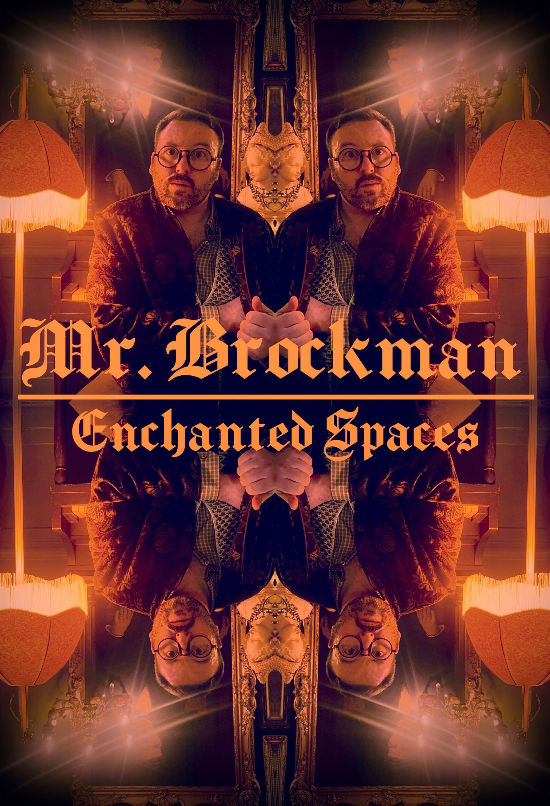
    Deep maroon ground, everything lit by lamplight from one side. Heavy velvet textures, a blackletter wordmark, gold hairline rules. Content sits inside framed panels like paintings on a dark wall.

    Type: Pirata One wordmark, Bodoni Moda headings, EB Garamond body, Beth Ellen for your own voice.

    Theatrical Nocturnal Highest perceived price

    This is the closest to the poster you already made. It is the one that most clearly says you are not a cheap internet psychic.

    II

    The Curiosity Cabinet

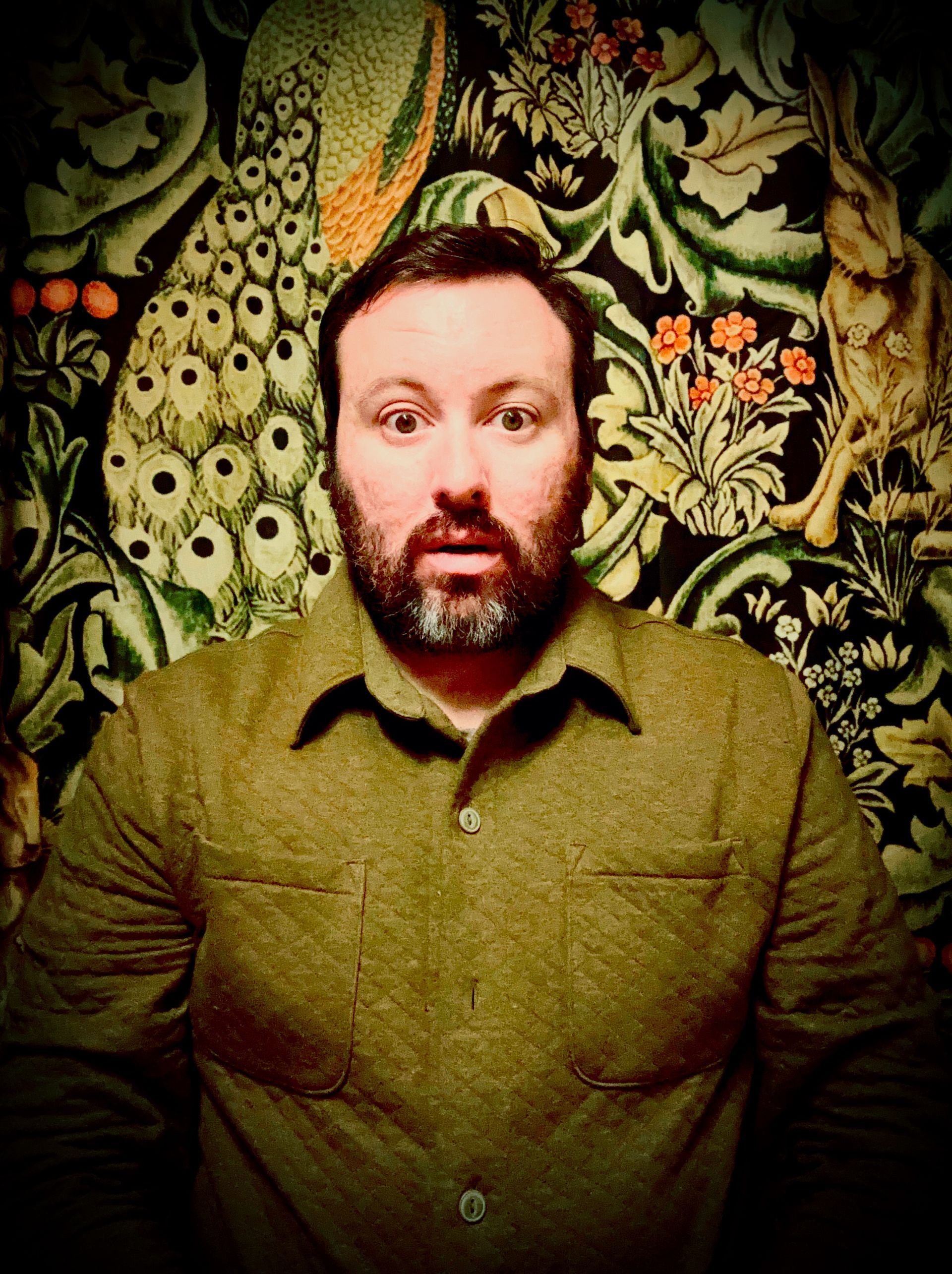
    Forest green William Morris ground with maroon as the accent instead of the base. The gallery wall drives the layout: everything is an object in a collection, captioned like a museum label.

    Type: Bodoni Moda wordmark with letterspaced small caps, EB Garamond body, Beth Ellen captions.

    Collected Daylight Most content friendly

    The friendliest of the three and the easiest to keep adding to over the years. Reads scholarly rather than mystical.

    III

    A Fool's Journey

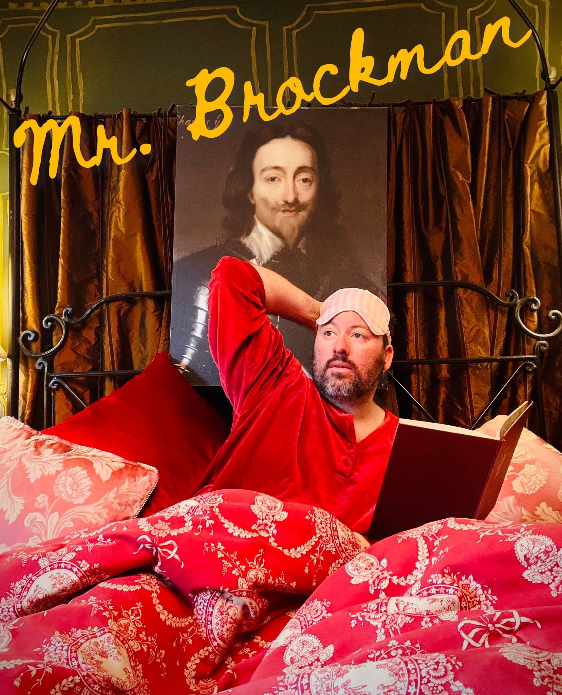
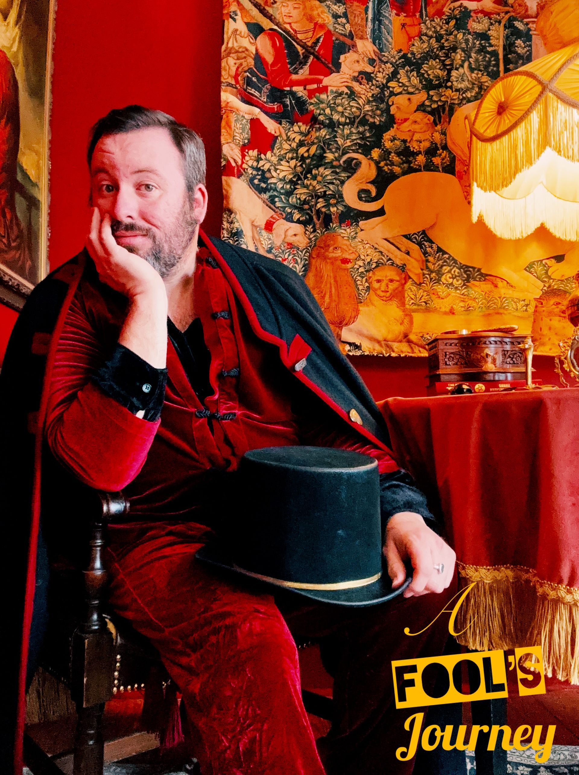
    Maroon and blush, more air, more wit. Big handwritten callouts scrawled across the photography the way you caption things yourself. Tarot card proportions used as the card system.

    Type: Beth Ellen leads, Bodoni Moda supports, EB Garamond body. The handwriting is the brand.

    Playful Warmest Most shareable

    Truest to the playful and fun you asked for. A little softer on the luxury signal, strongest for social and for growing your list.

    What I would do: Direction I as the base, with the handwriting energy of Direction III layered on top. Maroon and gold do the selling, Beth Ellen does the talking. Direction II is the safest of the three, but it would cost you the thing that makes you unmistakable.

    Part Three

    Your palette

    Maroon is the signature, the way you asked for it. Gold is the only metal. Everything else supports and never competes.

    Brockman Maroon #7A1F2B
    Oxblood #4E1119
    Parlour Ink #120C0E
    Antique Gold #C29A46
    Candlelight #F2B25C
    Morris Green #24402F
    Blush #E3A9AE
    Parchment #EFE3D0

    How they get used

    Roughly 60 percent ink and oxblood ground, 25 percent maroon, 10 percent parchment text, 5 percent gold and candlelight. Gold is a highlight, never a fill. The moment gold covers a large surface the site stops looking expensive and starts looking like a casino.

    Readability

    Parchment on Parlour Ink and parchment on oxblood both clear accessibility contrast comfortably, so the site stays readable for everyone. Gold is approved for headings, rules, and icons at large sizes only. Body copy never runs in gold.

    Part Four

    Your typography

    Beth Ellen stays, because it is already yours. It just gets a job description instead of doing everything.

    Wordmark Pirata One
    Mr. Brockman
    Headings Bodoni Moda, 700
    The hour has arrived
    Your voice Beth Ellen, accents only
    I am not here to tell you the future. I am here to show you the room you are standing in.
    Body EB Garamond, 400
    A reading with Mr. Brockman is not a party trick and it is not a horoscope. It is one hour, in one room, with one person who will describe your life back to you in a way you have not been able to say out loud yet. Some people leave with a decision. Most leave with permission.
    Labels EB Garamond, letterspaced caps
    Book a Reading  ·  The Shop  ·  Testimonials

    One rule about Beth Ellen. It never runs longer than two lines, and it never carries anything a visitor needs in order to do something. Buttons, prices, form labels, and navigation stay in the serif faces. The handwriting is the seasoning, which is exactly what keeps it feeling special.

    Part Five

    How the clock works

    The idea you described on the phone, turned into something that will not break on a phone or confuse a first time visitor.

    On a computer

    • Five brass stations sit evenly around the face, one for each page. The roman numerals stay on the dial so it still reads as a clock at a glance.
    • Every station is labelled on the dial with its page name and its hour, so nobody has to guess what a marker means or go hunting for a legend.
    • The hand rests on whichever page someone last visited and swings across to follow whatever they hover.
    • A second hand sweeps continuously, so the face feels alive even when nobody is touching it.
    • An ordinary text menu still lives in the header. The clock is the delight, not the only way in.

    On a tablet or phone

    The clock shrinks to a tappable ring near the top and stays interactive. Below it, the same five destinations repeat as a gilded list, so a thumb never has to hit a small target.

    The Parlour XII
    The Readings II
    Book V
    The Shop VII
    The Mirror X

    Anyone navigating by keyboard tabs through the stations in order with a visible gold focus ring, and anyone who has motion turned down gets the clock without the sweep. The delight never comes at the cost of someone being able to use the site.

    Part Six

    The mirror, made literal

    Your poster is already a mirror image. I do not think that was an accident, and I want to turn it into a system.

    Enchanted Spaces

    Section breaks

    Every major heading gets a faded reflection beneath it. Costs nothing, appears everywhere, and becomes instantly recognizable as yours.

    Testimonials

    Client words presented inside oval gold mirror frames rather than rectangles. The quote is what they saw in themselves.

    The About page

    Called The Mirror. It opens with your portrait and the line that the page is not really about you, then turns the questions on the reader.

    Part Seven

    The gallery wall

    You already shot the photography, and it is the single biggest asset this project has. Here is where each of these lands.

    What is still missing

    Ten to fifteen detail shots to fill the wall between the portraits: hands, candles, the music box, the tarot deck, a doorway, the corner of a frame. Shoot them the same way you shot these, on your phone, in your house, in the same light.

    How they get treated

    Warm grade, deep shadows, a little grain, a hard vignette. Portraits get heavy ornate frames, details get thin flat frames, and nothing is cropped to a perfect square. The unevenness is what makes it read as a real wall instead of a stock gallery.

    Part Eight

    Five pages, five stations

    Your five page build, mapped to the clock. Click a station at the top of this page and the matching one lights up here.

    Station XII  /  Home

    The Parlour

    Arrival. The clock, your name, one sentence of promise, and a single thing to do next. No scrolling wall of text.

    • Clock navigation and the mirrored portrait
    • One line on what a reading actually is
    • Three testimonials in mirror frames
    • Email signup, written as an invitation into the house
    • Your Instagram feed at the base

    Station II  /  Services

    The Readings

    What you actually do, framed as specialist work rather than fortune telling. This is where the mental surgeon idea lives.

    • The individual reading, described honestly
    • Coaching packages for people who come back
    • What a session is not, which builds more trust than what it is
    • Pricing, or by consultation if you would rather keep it private

    Station V  /  Booking

    Book a Reading

    Your calendar, your availability. You read internationally, so time zones get handled carefully here.

    • Calendar sitting inside a gold frame so it does not look bolted on
    • Short intake: name, what brought you, time zone
    • Confirmation email written in your voice, not a system default
    • A quiet note about how you work, which filters out the wrong client before they book

    Station VII  /  Store

    The Shop

    You said yes to a shop and left the details open, so I have scoped it as a small curated shelf rather than a catalog. Easy to grow later.

    • Gift certificates for readings, which sell better than most people expect
    • Recorded or written readings as a lower priced way in
    • Anything physical you want to sell out of the house
    • Product photography in the same gold frames

    Station X  /  About

    The Mirror

    Your story, told so the reader keeps seeing themselves in it, ending by turning the page around on them.

    • The Morris wallpaper portrait and your own words in your handwriting
    • How you found this work and why you do it your way
    • The full testimonials wall
    • Contact, and the second email signup

    Utility  /  Not on the clock

    The Back Rooms

    The pages every site needs. They live in the footer, styled to match, never competing for attention.

    • Privacy policy, which I am writing for you
    • Terms and a cancellation policy for bookings
    • Thank you and confirmation pages
    • A 404 page using the Charles I bed photo

    Part Nine

    Settled, and still open

    None of this changes how the site looks. All of it has to be sorted before I start building.

    Already settled

    • Scope. Five pages, plus the footer pages listed above.
    • The goal. Growing your list. Every page carries one signup, written as an invitation rather than a newsletter box.
    • Booking and the shop. Both built in, with your calendar and payments connected.
    • Analytics. Set up from day one, so you can see what is actually bringing people in.
    • Privacy policy. I am writing it, you do not need to think about it.
    • Timing. Live next month, as long as your content reaches me in the next two weeks.

    What I need from you

    • A direction. One of the three, or a mix. Everything else waits on this one.
    • Your services and pricing. This was blank on the questionnaire, and I cannot write The Readings without it.
    • What the shop sells. Even a rough list gets me started.
    • Testimonials. You said you have them. I need the actual words, and permission to use first names.
    • Your social links. There is an Instagram feed planned for the homepage.
    • The rest of the photos. The four portraits are strong. I need the detail shots to fill the wall between them.

    One quick thing about your domain.

    You wrote down Mr.Brockman.com . A web address cannot have a dot inside the name that way, so what you wrote would actually be a subdomain called "mr" sitting on a site called brockman.com, which belongs to someone else. The version that works is mrbrockman.com , and it is available right now. I would grab it this week before someone else does. Worth picking up mrbrockman.co and brocksbury.com at the same time, since your email already uses that word and it is more ownable than a surname.

    Part Ten

    What happens next

    This week

    Tell me which one

    Look through the three directions and tell me which one feels like your house. If the answer is pieces of more than one, say that instead, it is a better answer. I will register the domain the same day.

    Week two

    Send me your words

    Pricing, testimonials, and the rest of the photographs. I design your homepage in full and you approve it before I build anything else, so there are no surprises.

    Weeks three and four

    I build it and we go live

    I build every page, wire up booking, the shop, and analytics, write the privacy policy, test it on every screen size, and put it in the world. Then you tell people the hour has arrived.

    It is time to transform.

    Prepared for Christopher Brockman by You Digital Co.  ·  August 2026